How to Pick the Colours for Your Layout

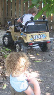
I know alot of newbies' are often stumped by what colours to pick for their layouts. I think the easiest way to do this is to glance at the photo's and say the first colour that comes to mind, then look for the next most obvious colour and finally an accent colour that goes with the first two colours and is represented in the smallest quantity within your photos. You need to think of the rule of three. The first colour you pick is going to be represented the most within the photos and would account for 2/3 of the finished layout. Then your second most popular colour which will represent approx 1/3 of the finished layout and finally your third colour which will be used as an accent (this will have the most effect on your layout if this colour is on the opposite side of the colour wheel to your other colours). Another method is to find one colour that is represented alot in the photos and use varying shades of that colour for your layout with the accent colour being the colour represented least in your photos. I often cheat at this process though by dressing my kids in co-ordinating outfits or outfits that will match a major element or theme of the photo's.......... or I'll dress them to co-ordinate with a paper I've just bought and would love to use..... As you can see in this photo of my son's 5th Birthday I dressed the kids to match his present! I know! I know! Its cheating.... but it's a good kind of cheating don't you think?


Comments