A variety of Options - Acetate overlays.
I recently obtained some acetate overlays 12 x 12 (pack of 6) very cheaply. Anyway I was looking through the overlays and really wanted to use this one. So I dug out some old photos (taken pre digital camera days).
Usually when I'm doing a layout I'll pull out several papers that go with my theme, or colours or the mood I wish to convey, or perhaps that match my photos or the embellishments I wish use. Once I have pulled out all the possible choices available to me I'll make a decision. If this is too hard for me or if I'm conflicted I'll often take my choices to my DH along with the photos and ask for his opinion. Being an artist he has a good eye. Anyway this time I was able to make the entire layout on the acetate and then show him background choices.
I think this is a great way to work on your own style and set out. It can teach you how to choose a good complimentary background for your photos.
Below are the options I presented to him.
1.
2.
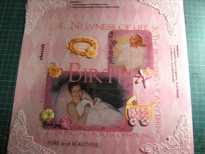
Usually when I'm doing a layout I'll pull out several papers that go with my theme, or colours or the mood I wish to convey, or perhaps that match my photos or the embellishments I wish use. Once I have pulled out all the possible choices available to me I'll make a decision. If this is too hard for me or if I'm conflicted I'll often take my choices to my DH along with the photos and ask for his opinion. Being an artist he has a good eye. Anyway this time I was able to make the entire layout on the acetate and then show him background choices.
I think this is a great way to work on your own style and set out. It can teach you how to choose a good complimentary background for your photos.
Below are the options I presented to him.
1.

2.
 3.
3. 4.
4. What's your favourite? My DH loves number 1. While my favourite is number 3......... hmm
Hard choice girls. I'm looking for some help here....


Comments